
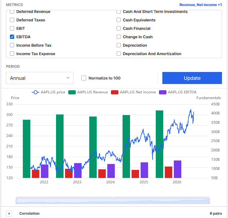
Fundamental research is easier when the comparisons stay in one place. The Fundamental Analysis workspace lets you put price and company financials into a focused chart grid, then compare the same time range across the names and metrics that matter to your research.
Use the workspace to review a single company in detail or compare a small group side by side. It is designed for research: it does not create orders or turn a financial metric into a trade recommendation. It gives you a consistent way to inspect reported financial periods, price history, and how series move together before you move a name into a watchlist, screen, or deeper review.
Start with a comparison grid
Choose one, two, four, six, or eight charts. A one-chart layout works well for a detailed financial review. A four-chart layout is useful for comparing competitors, a sector group, or the leading results from a screen. Six and eight charts make it easier to scan a larger set without losing the shared date range.
The Grid, Start date, and End date controls apply to the workspace. The quick-grid controls change the layout without forcing you to rebuild every chart. Use Update charts after changing the shared range or grid.
Find a company by ticker or name
Every chart has its own symbol search. Type a ticker such as AAPL.US or a company name such as Apple Inc.. Suggestions are scoped to the market tab, so a US, Canadian, Indian, or Australian comparison stays in the correct universe.
Each chart can contain more than one symbol. That makes it practical to compare the same financial metric across peers, or to compare several price series before choosing a company for a deeper fundamental review.
Choose price, fundamentals, or both
Set the chart type on each card:
- Price: Review the selected symbols as price series across the shared date range.
- Fundamentals: Plot financial statement values reported for the selected companies.
- Combined: Keep price and selected financial metrics in the same chart for a direct research comparison.
Combined charts are most useful when you have a specific question. For example, you might compare price with revenue and free cash flow, or compare several companies using the same balance-sheet metric. Avoid adding series just because they are available; a smaller set is easier to interpret.
Use the financial data already in the database
The metric picker reads the numeric, chartable fields from the canonical fundamental_financial_periods table. Core metrics such as revenue, gross profit, operating income, cash flow, assets, liabilities, debt, and shares retain clear financial-statement groupings. Additional numeric financial-period fields in the database are also included automatically, so the workspace does not silently stop at a short curated list.
Structural fields such as symbol identifiers, report dates, currency, and period flags are excluded because they are context for a series rather than values that should be plotted. The result is a picker made of chartable fundamentals rather than database metadata.
Search the metric picker
The metric search field sits inside the metric picker. Search by a readable metric name, database field name, or category. The list immediately hides nonmatching metrics and empty groups. Use the small x inside the search field to clear the filter.
This is useful when the table contains a broad set of fields. Search for terms such as revenue, debt, cash, asset, or EPS instead of scanning through every category.
Set annual or quarterly periods
Use Period on each chart to choose annual or quarterly reporting data. Annual series are useful for longer-term trends in revenue, margins, assets, and capital allocation. Quarterly series make it easier to see recent changes in operating performance and cash generation.
The chart-level Update action reloads only that card. This makes it possible to keep one annual view beside a quarterly view, or to compare a cash-flow chart with a balance-sheet chart without refreshing the rest of the workspace.
Overlay metrics without losing scale context
You can overlay up to eight selected metrics on a chart. When the raw values use very different magnitudes, turn on Normalize to 100. Every selected series is rebased to 100 at its first available point, making relative changes easier to compare across price, revenue, cash flow, and balance-sheet values.
Normalization answers a different question from raw values. Use raw values when the reported dollar amount or share count matters. Use normalized values when you want to compare the direction and relative size of changes across otherwise incompatible scales.
Read correlations with the data behind them
Each chart includes a collapsed Correlation section. It reports Pearson correlation for plotted series only when at least three report dates overlap. A missing pair is not an error: it usually means the two series do not share enough dates, often because one is price data and the other is reported annually or quarterly.
Correlation is a summary, not an explanation. A high correlation can be caused by a shared trend, the selected time window, or a small number of observations. Use it as a prompt for further review, not as a standalone conclusion.
A practical fundamental review routine
- Open Fundamental Analysis from Research and select the market.
- Choose a four-chart grid and set a shared start and end date.
- Search for the companies you want to compare by ticker or name.
- Use Fundamentals or Combined on each chart.
- Search the picker for a focused metric set such as revenue, operating income, free cash flow, and debt.
- Choose annual for a long-term review or quarterly for recent operating changes.
- Normalize series only when you need to compare relative movement across different units.
- Open Correlation when the chart contains enough overlapping dates to make the comparison meaningful.
Open the Fundamental Analysis workspace to build a research grid around the companies and financial metrics you want to study.